Formatting charts and graphs in Microsoft Excel is the key to transforming basic visuals into professional, easy-to-understand presentations. While Excel can automatically generate charts, proper formatting helps highlight important data, improve readability, and make your work look polished.
In this guide, you’ll learn how to format charts and graphs in Excel step by step, along with practical tips to make them visually appealing.
Why Formatting Charts Matters
A plain chart may show your data, but a well-formatted chart communicates your message clearly. Good formatting helps you:
- Emphasize key insights
- Improve readability
- Make your charts visually attractive
- Present data professionally
Read: How to Create Charts and Graphs in Excel (Step-by-Step Guide for Beginners)
Step-by-Step: How to Format Charts in Excel
Once you’ve created a chart in Microsoft Excel, follow these steps to customize it.
Step 1: Select the Chart
Click on your chart to activate the Chart Design and Format tabs in the ribbon. These tabs contain all formatting options.
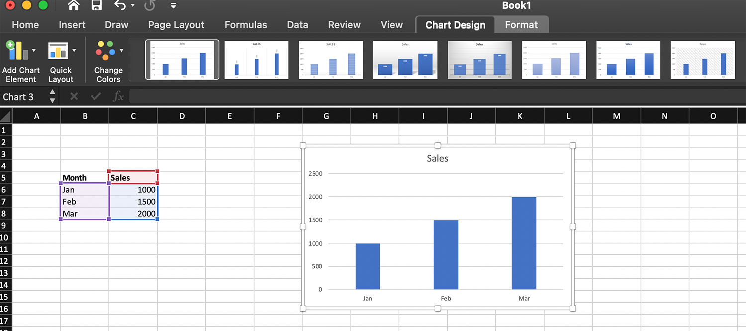
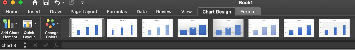
Step 2: Change Chart Style
Excel provides built-in styles to quickly enhance your chart.
- Click the chart
- Go to Chart Design
- Choose from the available Chart Styles
These styles instantly adjust colors, fonts, and layouts.
Step 3: Customize Chart Colors
To make your chart visually consistent:
- Click the chart
- Go to Chart Design
- Click Change Colors
- Select a color palette
Choose colors that are easy to distinguish and not too bright.
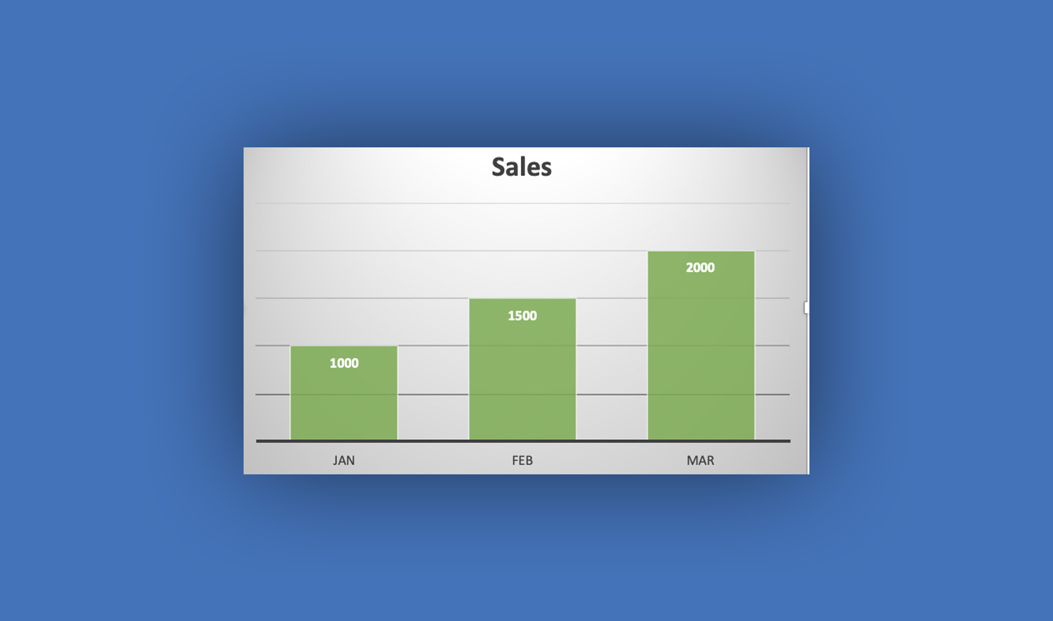
Step 4: Format Chart Title
The chart title explains what your data represents.
- Click the chart title
- Type a clear and descriptive name
- Use the Format tab to:
- Change font size
- Apply bold or italic styles
- Adjust color
Example: “Monthly Sales Performance 2026”
Step 5: Format Axes (X and Y)
Axes help viewers understand your data scale.
- Click the horizontal or vertical axis
- Right-click and select Format Axis
- Adjust:
- Minimum and maximum values
- Number format (e.g., currency, percentage)
- Axis labels
This is especially useful when dealing with large numbers or percentages.
Step 6: Add and Format Data Labels
Data labels show exact values on the chart.
- Click the chart
- Click the + (Chart Elements) button
- Check Data Labels
To format:
- Right-click a label → Format Data Labels
- Change position, font, or number format
Step 7: Modify the Legend
The legend explains what each color or series represents.
- Click the legend
- Drag to reposition (top, bottom, left, right)
- Use the Format tab to adjust font and style
If your chart is simple, you can remove the legend to reduce clutter.
Step 8: Adjust Gridlines
Gridlines make it easier to read values.
- Click the chart
- Click the + (Chart Elements) button
- Enable or disable Gridlines
Keep them light and subtle to avoid distraction.
Step 9: Format Data Series
You can customize individual bars, lines, or slices.
- Click a data series (e.g., a bar or line)
- Right-click → Format Data Series
- Adjust:
- Fill color
- Border
- Transparency
- Line thickness
This is useful for highlighting specific data points.
Step 10: Resize and Align the Chart
A well-positioned chart improves presentation.
- Drag corners to resize
- Align with other elements in your worksheet
- Keep proportions balanced
Advanced Formatting Techniques
Once you know the basics, try these advanced options in Microsoft Excel:
Use Combo Charts
Combine two chart types (e.g., column and line) to compare different data sets.
Apply Conditional Formatting to Charts
Highlight values dynamically by linking chart colors to conditions in your data.
Add Trendlines
Show patterns or predictions:
- Click chart
- Click + (Chart Elements)
- Select Trendline
Use Secondary Axis
Useful when comparing two data sets with different scales.
Best Practices for Formatting Charts
To make your charts more effective:
Keep it clean. Avoid too many colors or elements.
Use readable fonts. Choose simple fonts and appropriate sizes.
Highlight key data. Use contrasting colors to draw attention.
Avoid 3D charts. They can distort data and confuse viewers.
Be consistent. Use the same style across multiple charts.
Common Formatting Mistakes to Avoid
- Overcrowding the chart with too much information
- Using colors that are hard to distinguish
- Missing titles or labels
- Inconsistent formatting across charts
Fixing these issues can greatly improve your chart’s clarity.
Conclusion
Formatting charts and graphs in Microsoft Excel is just as important as creating them. With proper styling, labeling, and layout, your charts become powerful tools for communication.
Take time to experiment with different formatting options, and always focus on clarity and simplicity. A well-formatted chart doesn’t just look good—it tells a story your audience can easily understand.
Read Also: How to Enable Macros in Excel: Step-by-Step Guide (With Examples)