Creating charts and graphs in Microsoft Excel is one of the most powerful ways to turn raw data into clear, visual insights. Whether you’re working on school projects, business reports, or personal budgets, charts help you understand trends, compare values, and present information effectively.
In this easy-to-follow guide, you’ll learn how to create charts and graphs in Excel step by step, including tips to make them more professional and visually appealing.
Why Use Charts and Graphs in Excel?
Before diving into the steps, it’s important to understand why charts are useful. Instead of looking at rows and columns of numbers, charts allow you to quickly see patterns, relationships, and changes over time. They make your data easier to explain and more engaging for your audience.
Types of Charts You Can Create in Excel
Excel offers several chart types, each suited for different kinds of data:
- Column Chart – Best for comparing values across categories
- Line Chart – Ideal for showing trends over time
- Pie Chart – Used to display parts of a whole
- Bar Chart – Similar to column charts but horizontal
- Area Chart – Shows trends with emphasis on volume
- Scatter Plot – Displays relationships between variables
Choosing the right chart type is the first step toward effective data visualization.
Step-by-Step: How to Create a Chart in Excel
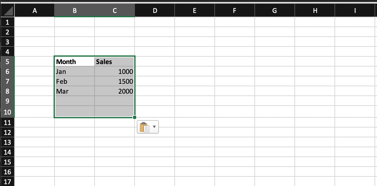
Step 1: Prepare Your Data
Start by organizing your data in a table format. Make sure:
- Each column has a clear heading
- There are no empty rows or columns
- Your data is consistent (numbers, dates, etc.)
Example:
| Month | Sales |
| Jan | 1000 |
| Feb | 1500 |
| Mar | 2000 |
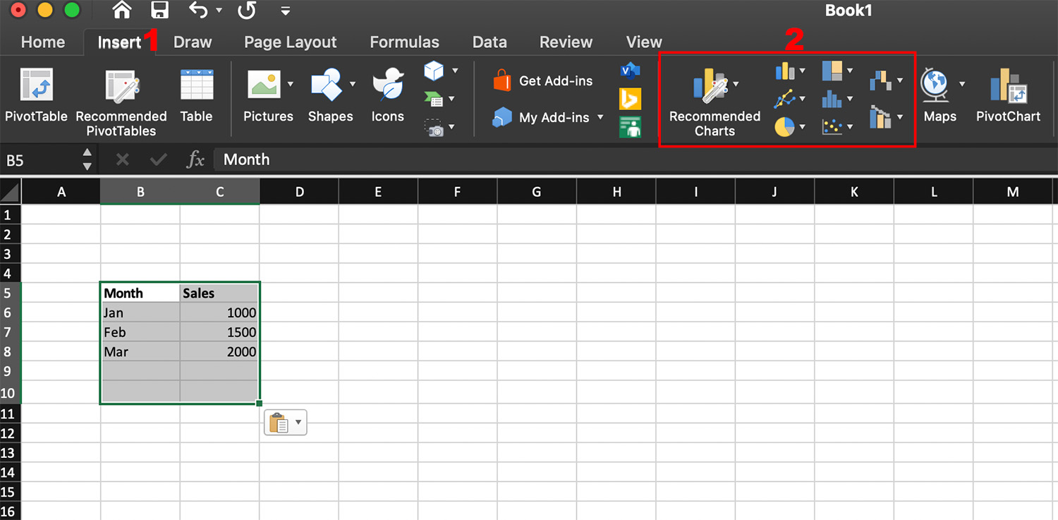
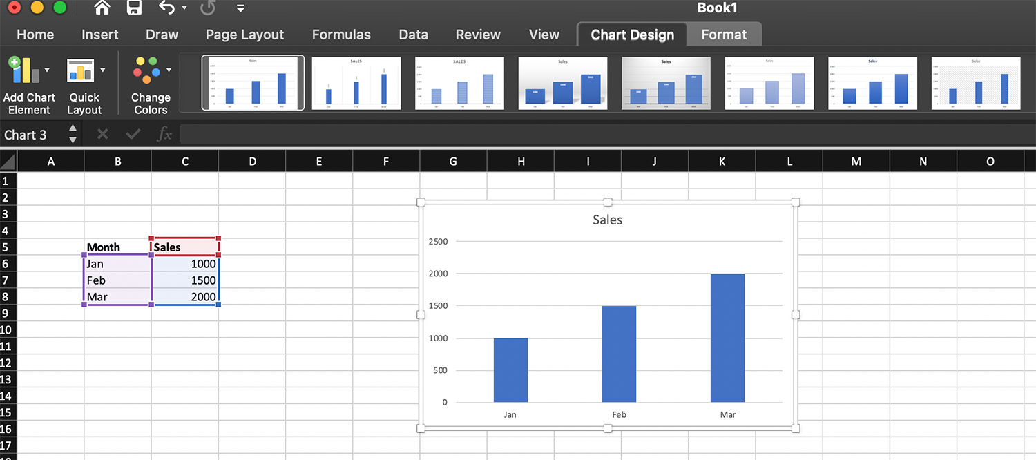
Step 2: Select Your Data
Click and drag to highlight the data you want to include in your chart. Be sure to include both labels and values.
Step 3: Insert a Chart
- Go to the Insert tab on the Excel ribbon
- Look for the Charts group
- Click on your preferred chart type (e.g., Column, Line, Pie)
- Select a specific chart style
Excel will automatically generate a chart based on your selected data.
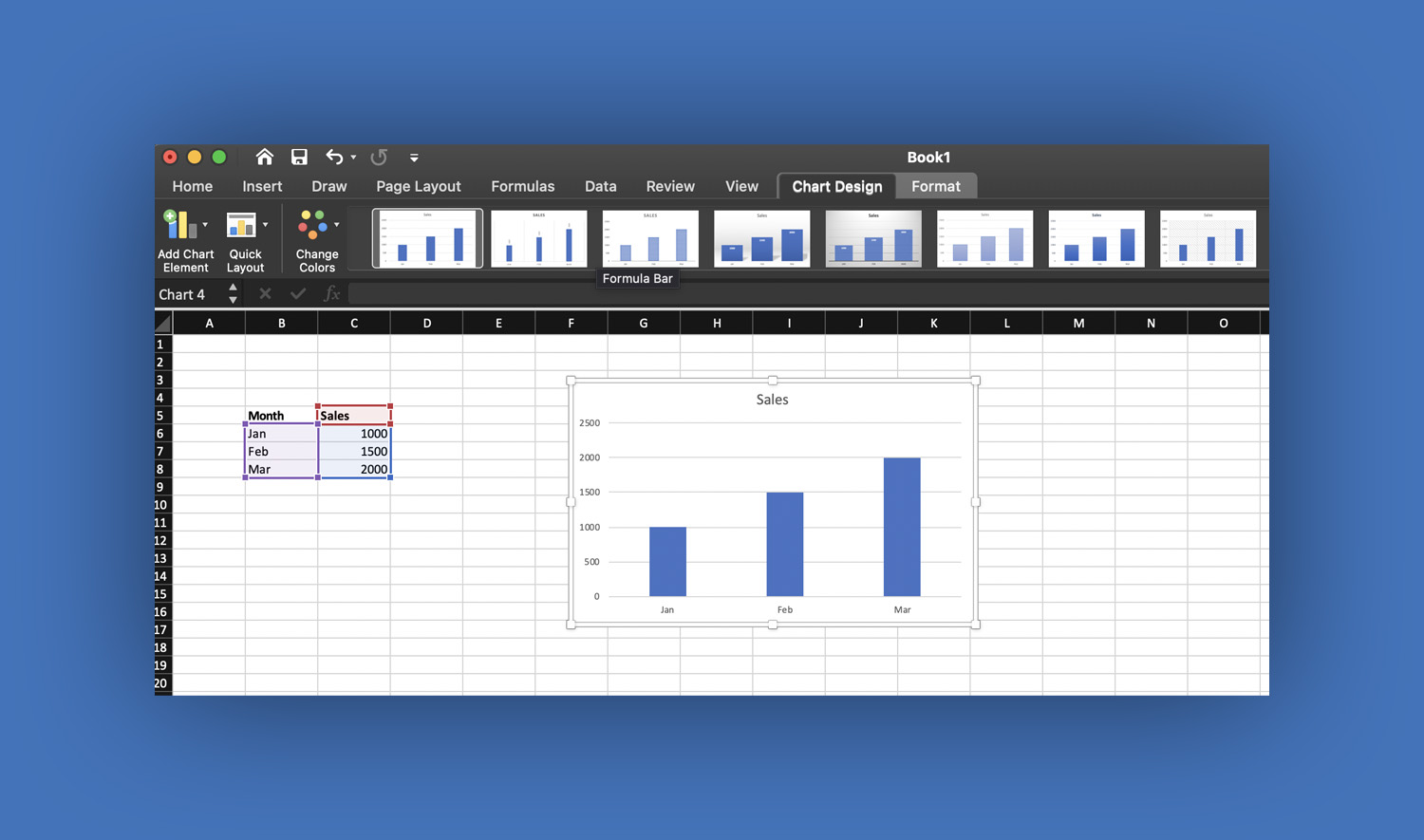
Step 4: Customize Your Chart
Once your chart appears, you can modify it to suit your needs.
Add Chart Title
Click on the default title and type a meaningful name (e.g., “Monthly Sales Report”).
Edit Axis Labels
- Horizontal axis = categories (e.g., months)
- Vertical axis = values (e.g., sales)
Change Colors and Styles
Use the Chart Design tab to apply different styles and color themes.
Step 5: Add Chart Elements
To make your chart clearer, add extra elements:
- Data Labels – Show exact values on the chart
- Legend – Explains what each color represents
- Gridlines – Help in reading values accurately
Click the “+” (Chart Elements) button next to the chart to add these features.
Step 6: Resize and Move the Chart
You can click and drag the chart to reposition it. Use the corners to resize it according to your layout.
How to Create Different Types of Graphs
Creating a Line Graph
A line graph is perfect for showing trends over time.
- Highlight your data
- Go to Insert
- Click Line Chart
- Choose a style
This is commonly used for tracking growth, such as monthly sales or website traffic.
Creating a Pie Chart
A pie chart shows proportions.
- Select your data
- Go to Insert
- Click Pie Chart
- Choose a 2D or 3D pie chart
Make sure your data represents parts of a whole (e.g., budget allocation).
Creating a Bar Graph
Bar graphs are useful when category names are long.
- Select your data
- Go to Insert
- Click Bar Chart
- Choose your preferred style
Tips for Creating Better Charts in Excel
Creating a chart is easy—but making it effective takes a bit more effort.
Keep it simple. Avoid cluttering your chart with too many elements.
Use clear labels. Always include titles and axis labels so viewers understand your data.
Choose the right chart type. Don’t use pie charts for too many categories.
Use consistent colors. Stick to a simple color scheme for better readability.
Highlight important data. Use bold colors or labels to emphasize key points.
Common Mistakes to Avoid
Many beginners make simple mistakes when creating charts:
- Using the wrong chart type
- Including too much data
- Forgetting to label axes
- Overusing 3D charts (they can be misleading)
Avoiding these will make your charts more professional and easier to understand.
Advanced Features You Can Try
Once you’re comfortable with basic charts, explore these advanced options in Microsoft Excel:
- Combo Charts – Combine two chart types (e.g., column + line)
- Pivot Charts – Create charts from PivotTables
- Dynamic Charts – Automatically update when data changes
- Sparklines – Mini charts inside cells
These features are useful for more complex data analysis and reporting.
Conclusion
Learning how to create charts and graphs in Microsoft Excel is an essential skill for students, professionals, and anyone working with data. With just a few clicks, you can transform numbers into meaningful visuals that are easy to understand and share.
Start with simple charts, practice regularly, and gradually explore advanced features. The more you use Excel charts, the more confident and efficient you’ll become in presenting data.
Read also: How to Use Scenario Manager in Excel: A Complete Beginner-Friendly Guide