Trendlines and forecasting in Microsoft Excel help you analyze patterns in your data and make informed predictions about the future. Whether you’re tracking sales, expenses, or growth trends, these tools allow you to turn historical data into meaningful insights.
In this guide, you’ll learn how to add trendlines, understand different types, and use forecasting features in Excel effectively.
What is a Trendline?
A trendline is a line added to a chart that shows the general direction or pattern of your data. It helps you quickly see whether values are increasing, decreasing, or staying consistent over time.
For example, if your monthly sales are growing, a trendline will slope upward, making the trend easy to visualize.
What is Forecasting?
Forecasting uses past data to predict future values. In Microsoft Excel, forecasting tools analyze trends and extend them forward, helping you estimate what might happen next.
This is especially useful for:
- Business planning
- Budgeting
- Sales projections
- Inventory management
How to Add a Trendline in Excel
Follow these simple steps to add a trendline to your chart:
Step 1: Create a Chart
First, insert a chart (such as a line or column chart) using your data.
Read: How to Create Charts and Graphs in Excel (Step-by-Step Guide for Beginners)
Step 2: Select the Chart
Click anywhere on the chart to activate it.
Step 3: Add a Trendline
- Click the + (Chart Elements) button next to the chart
- Check the box for Trendline
Excel will automatically add a default trendline (usually linear).
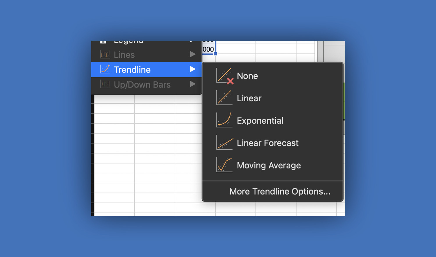
On Mac, you won’t see the “+” button like in Windows. Instead:
- Click the chart
- Go to the Chart Design tab
- Click Add Chart Element
- Select Trendline
- Choose a type (e.g., Linear)
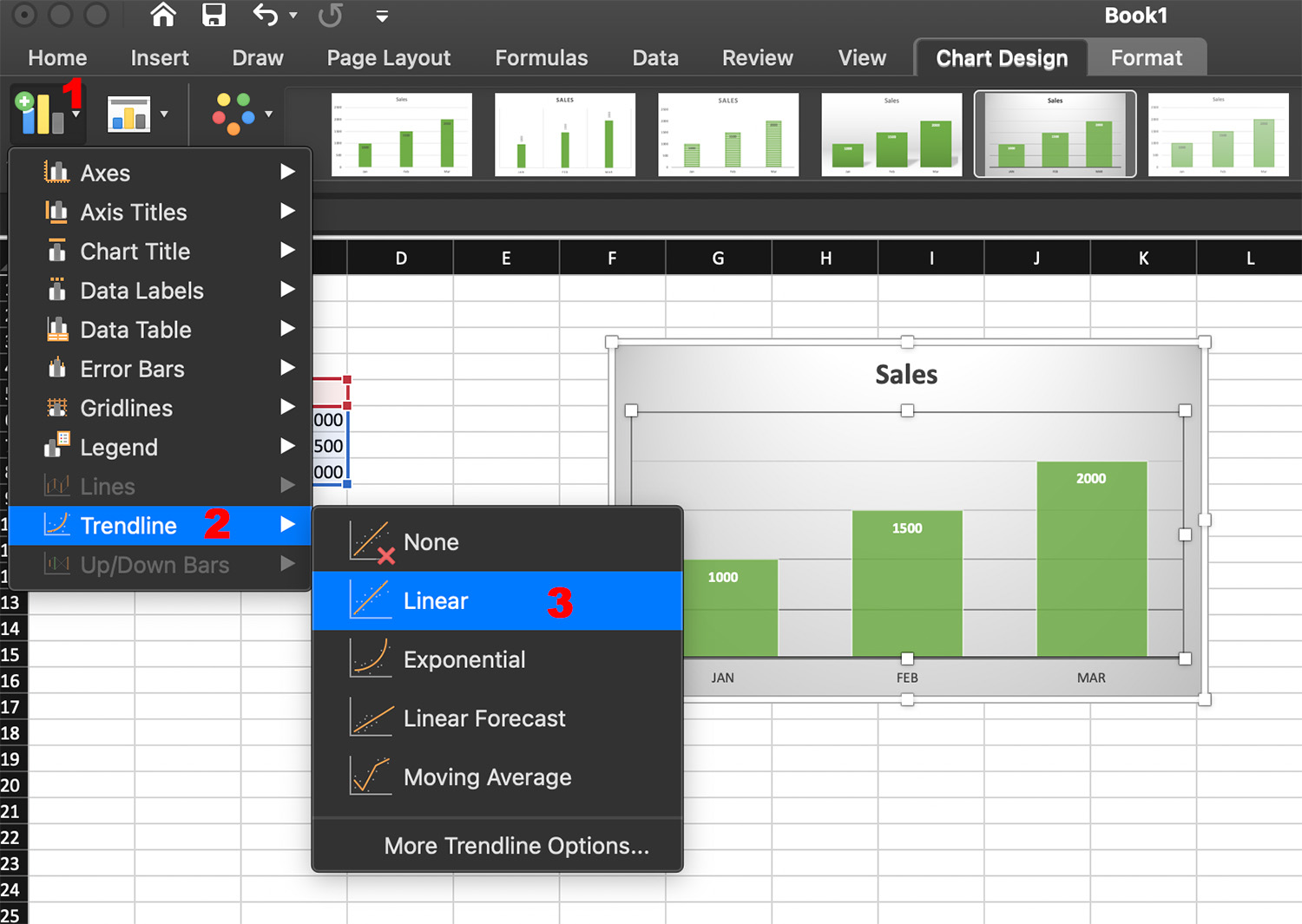
Step 4: Customize the Trendline
To modify the trendline:
- Right-click the trendline
- Select Format Trendline
From here, you can:
- Choose different trendline types
- Display the equation on the chart
- Show the R-squared value (measures accuracy)
Types of Trendlines in Excel
Choosing the right trendline type is important for accurate analysis.
Linear Trendline
Best for steady increases or decreases. It creates a straight line showing a consistent trend.
Exponential Trendline
Used when data grows or declines rapidly (e.g., population growth).
Logarithmic Trendline
Useful when growth slows over time.
Polynomial Trendline
Best for data with fluctuations or multiple peaks and valleys.
Moving Average Trendline
Smooths out fluctuations to show the overall trend more clearly.
How to Forecast Data in Excel
Method 1: Using Trendline Forecast
You can extend a trendline into the future:
- Add a trendline to your chart
- Open Format Trendline
- Under Forecast, set:
- Forward (e.g., 3 periods)
- Backward (optional)
Excel will extend the line beyond your existing data.
Method 2: Using Forecast Sheet (Recommended)
Forecast Sheet is a built-in tool in Microsoft Excel that creates a full forecast with charts and tables.
Steps:
- Select your data (including dates and values)
- Go to the Data tab
- Click Forecast Sheet
- Choose:
- Line chart or column chart
- Forecast end date
- Click Create
Excel will generate:
- A new worksheet
- Forecasted values
- Confidence intervals
Understanding Forecast Results
When using forecasting tools, you’ll see:
- Forecast Line – Predicted future values
- Confidence Interval – Range where values are likely to fall
- Seasonality – Repeating patterns over time
These elements help you judge how reliable your predictions are.
Practical Example
Imagine you have monthly sales data for one year. By adding a trendline or using the forecast feature, you can estimate sales for the next few months. This helps in planning inventory, setting targets, and making business decisions.
Tips for Accurate Forecasting
To get better results:
Use enough data. More data points lead to better predictions.
Ensure data consistency. Avoid missing or irregular values.
Choose the right trendline. Match it to your data pattern.
Check R-squared value. A value closer to 1 means better accuracy.
Avoid overfitting. Don’t use overly complex models for simple data.
Common Mistakes to Avoid
- Using trendlines on unrelated data
- Ignoring seasonal patterns
- Relying too heavily on predictions without validation
- Using too little historical data
Forecasting is helpful, but it should always be used with careful judgment.
Advanced Features to Explore
Once you’re comfortable, try these advanced tools in Microsoft Excel:
- FORECAST.ETS function – Advanced forecasting formula
- FORECAST.LINEAR – Simple linear predictions
- Dynamic charts – Automatically update with new data
These features allow for deeper analysis and automation.
Conclusion
Trendlines and forecasting in Microsoft Excel are powerful tools for understanding data and planning ahead. By learning how to visualize trends and predict future values, you can make smarter decisions in both personal and professional settings.
Start with simple trendlines, then explore Excel’s forecasting tools to unlock deeper insights from your data.